
In your trading journey you will need to move forward to a point where you consistently make profits and minimize losses, such that your Pnl is positive and your trading capital grows over time.
Once you have achieved that, which trust me is no easy task, you can start to think about maximising your returns.
This can be achieved in a number of ways, for example, by improving or optimising your order handling and trade management.
That might mean upgrading the platform you use, your trading style ,or stop loss and take profit placement, this will largely be personal to you so I can't really comment on that.
However, I can comment on how you might optimise your stock trade selection process. And do that through the lens of some recent real-world examples.
When I look for ideas and trading opportunities I am often looking for outliers stocks and set-ups that stand away from the the rest of the crowd and the average stock.
In the first instance I am often looking for stocks that haven't joined a trend,or that have been oversold or simillar.
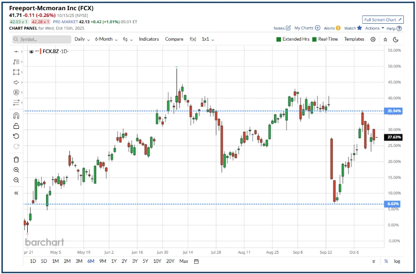
Here is a perfect example: US listed copper Miner Freeport-Mcmoran FCX, which sold off after a fatal accident at its Freeport Indonesia operations, in September.
However, the fact that the mine closed after the disaster, reduced global opper production, tightening its supply.
Source: Barchart.com
At the same time markets were getting ever more excited about Datacentre construction/AI demand, and what that woud mean for copper supplies, and prices, among other things.
We can see what happened next in the chart of copper below.
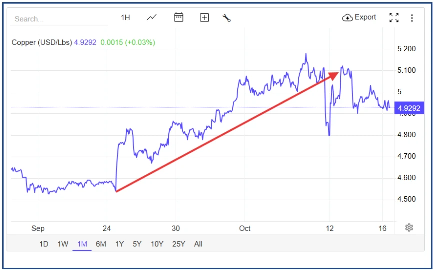
Source:Trading Economics
Remember that sentiment changes at the margins
Putting two and two together, it seemed obvious to me that FCX stock should rally in this situation. And that's exactly what happened. FCX rallied by more than +25.0%, trough to peak, in less than three weeks.
Impressive isn't it, or least it is until that is you compare FCX to UK listed copper play Antofagasta ANTO LN, which has trounced Freeport in performance terms, since July
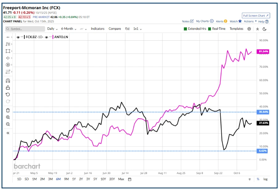
Source: Barchart.com
The takeaway here is that there may always be a better way to play a theme or narrative even if you are winning and winning well. But maybe it could be better.
If you think about it, it’s the reason that world class athletes, even those at very top of their game, have coaches, because they believe they can improve their performance..
Quantum Leap
Back on May 19th I was having a discussion on a trading discord, I contribute to, about news that Nvidia NVDA, was considering investing, in a start up, PsiQuantum, at a valuation of $6.00 billion, as part of a $750.0 million funding round.
I commented “Why not just buy D-WAVE QBTS ???” sharing the snapshot of the company below, as I did so.
Note the price of D-Wave here $12.76
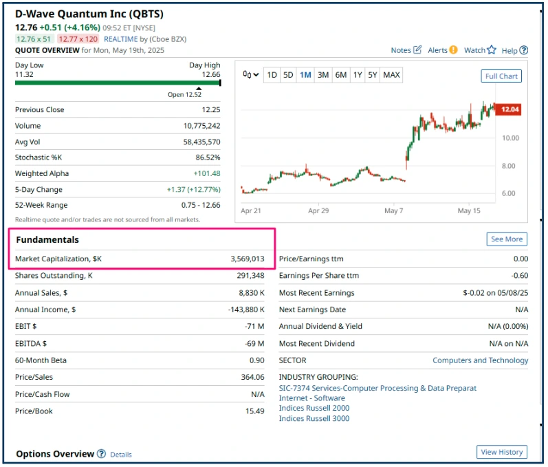
Source: Barchart.com
Now look at the price of D-Wave stock in this table of US listed quantum computing stocks from October 15th ( see below)
$44.80 The year to date change in QBTS is +445.0%.
None of the other stocks in the table come close to that performance.
On that basis alone we could think of D-Wave as a share price “category killer “ .
So we’ve established that I am not bad stock picker, but I think you may have had a hunch about that already, if you are regular reader of my articles.
What we really need to discover though is, is there a way to identify the outperformance, that's inherent in stocks like Antofagasta and D-Wave, at an early stage, or at least in running?
And the answer to that is yes I believe so.
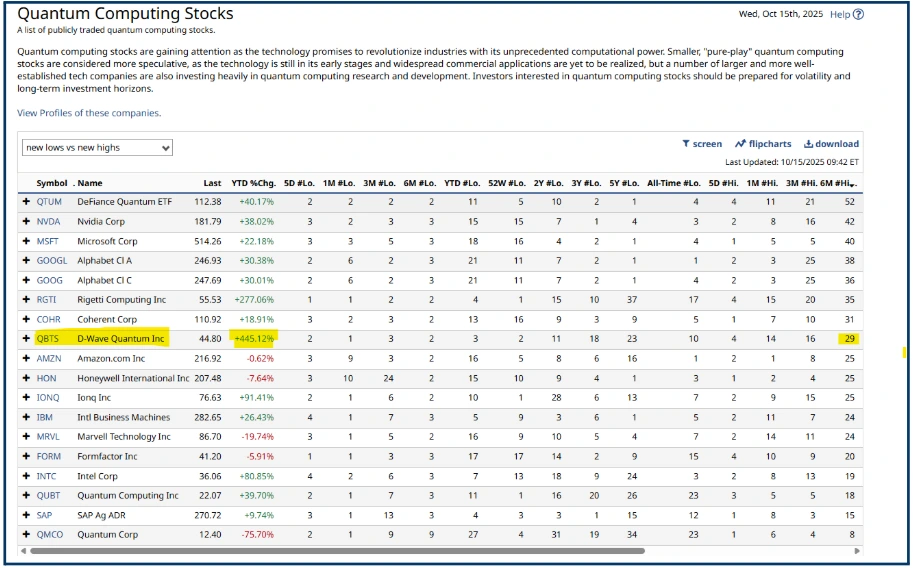
The table above is ranked by the its ultimate righthand column,which counts the number of new 6 month highs that the stocks in the list have posted.
However by this metric D-Wave is a mid table performer with just 29 highs versus 52 new 6 months highs for Defiance Quantum.
The number of new highs per se isn't the determining factor, however.
But if we divide the YTD % change by the number of new 6 month highs we find a value of 15.30 for D-Wave and one of just 0.77 for Defiance.
In truth we should probably divide the YTD % Change by the number of YTD high,s but hopefully you get the idea.
The difference between those values says to me that you got “more bang for your buck” in D-Wave,
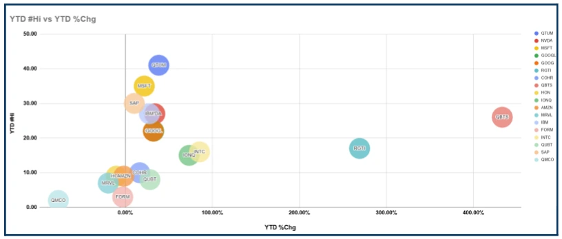
I have tried to visualise this in the bubble chart below, that plots the number of YTD highs against YTD percentage change in stock price, among the list of quantum computing stocks.
The farther over and higher to the right the better.
In my next article I will look at some more metrics and indicators that we can use to try and identify trade opportunities in winners and potential outperformers so until then.
The information provided does not constitute investment research. The material has not been prepared in accordance with the legal requirements designed to promote the independence of investment research and as such is to be considered to be a marketing communication.
All information has been prepared by ActivTrades (“AT”). The information does not contain a record of AT’s prices, or an offer of or solicitation for a transaction in any financial instrument. No representation or warranty is given as to the accuracy or completeness of this information.
Any material provided does not have regard to the specific investment objective and financial situation of any person who may receive it. Past performance is not a reliable indicator of future performance. AT provides an execution-only service. Consequently, any person acting on the information provided does so at their own risk. Forecasts are not guarantees. Rates may change. Political risk is unpredictable. Central bank actions may vary. Platforms’ tools do not guarantee success.