A key concept
Momentum is a key concept as far as trading the markets is concerned, but what do we specifically mean when we talk about momentum in the context of trading?
If we look up the word in the dictionary, we find definitions such as these:
The quantity of motion of a moving body, which is calculated as a product of its mass and velocity.
or
The Impetus gained by a moving object
The prices of financial instruments are not physical objects, but they do share some properties with them, at least they do to my mind.
In trading, momentum is what creates breakouts and trends, it is the force that turns modest moves into much larger ones and keeps them going.
Price momentum occurs when a trading opportunity or strategy is adopted by the crowd, or when new information comes into the market and changes the basis.
For example, an economic data release, company earnings, an interest rate rate change or a central bank statement on policy.
Momentum can also be created by technical factors and positioning. For example, in a short squeeze, or by the hedging activities of derivatives traders and market makers.
Or indeed by geopolitical or climatic factors, which can dramatically affect the price of commodities.
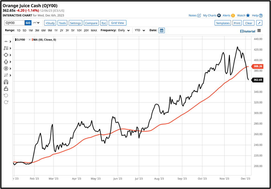
As here (see below) in Orange Juice, the price of which more than doubled between early February and late November 2023.

Of course, it's all very well to look back and talk about these things with the benefits of hindsight but as traders we want to be able to identify momentum as it first occurs or very close to that point.
So how can we highlight emerging momentum?
Spotting and quantifying momentum can be accomplished in many ways.
f you have plenty of screen real estate you can fill that up up with watch lists or charts and spend your day looking at those, trying to spot the movers and then drilling down into them to see what's happening to the individual instrument prices.
However, that is not a very efficient use of time and resources and if you are anything like me you will start to zone out after any length of time doing that.
An alternative strategy might be to screen charts, hoping to spot signs of momentum taking hold, but how many charts can you pay attention to or put another way, bear to look at, before your attention begins to wander?
Data-driven approach
A better way to try and identify momentum is to look at data and indicators and as luck would have it there are quite a few indicators that can highlight price momentum in either direction.
Moving averages are one such indicator- a moving average is simply a rolling plot of an instrument's average price over a given time frame. The shorter the frame the more frequently the moving average is updated, the longer the time frame, then the longer there is between recalculations, and we can use that characteristic to our advantage.
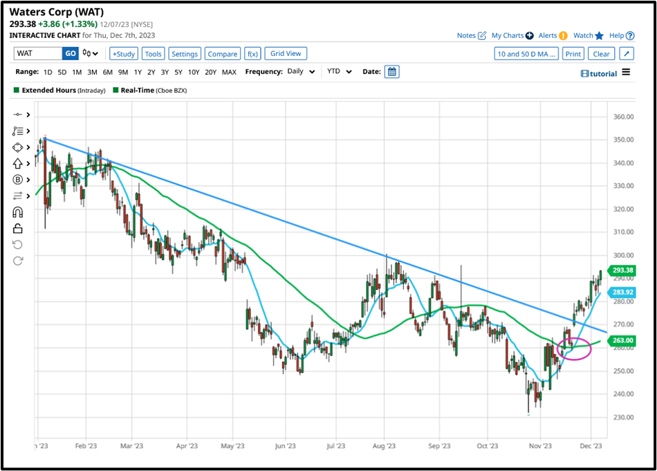
The interaction between faster and slower-moving averages is all about proce momentum and the underlying sentiment that drives it. We can see that in action in the chart below which plots the price of medical device maker Waters Corp alongside its 10 and 50-day moving averages in blue and green respectively.

I have circled the point at which the faster-moving 10-day line crosses up through the slower-moving 50-day line in this case that signal, known as a golden cross, confirms the upward momentum in the price action. The stock price subsequently gapped higher and has traded up to and above $293.00, some $30.00 above the signal price.
Great so we have established that an MA cross can indicate and or confirm the presence of momentum, but we still need to find those opportunities so how can we do that?
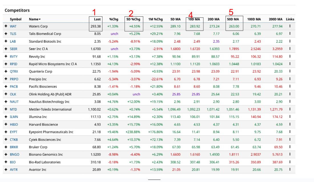
Well, earlier I mentioned that we can look at data and I have set out an example below in this case a table of Waters Corp’s competitors though it could just as easily be the members of the Dow, the Nasdaq 100 or the FTSE or any other group of stocks or instruments.
This table has been set up to show the values for a range of data related to momentum for example, column 2 shows us the 5-day % change whilst column 5 is the 50-day MA for the stocks in the table.

By studying the table we can look for stocks whose price has been rising, but whose 10 D MA is still below the value of the 50-day line.
If you want to go further, you create a spreadsheet with this sort of data and then filter using these kinds of rules.
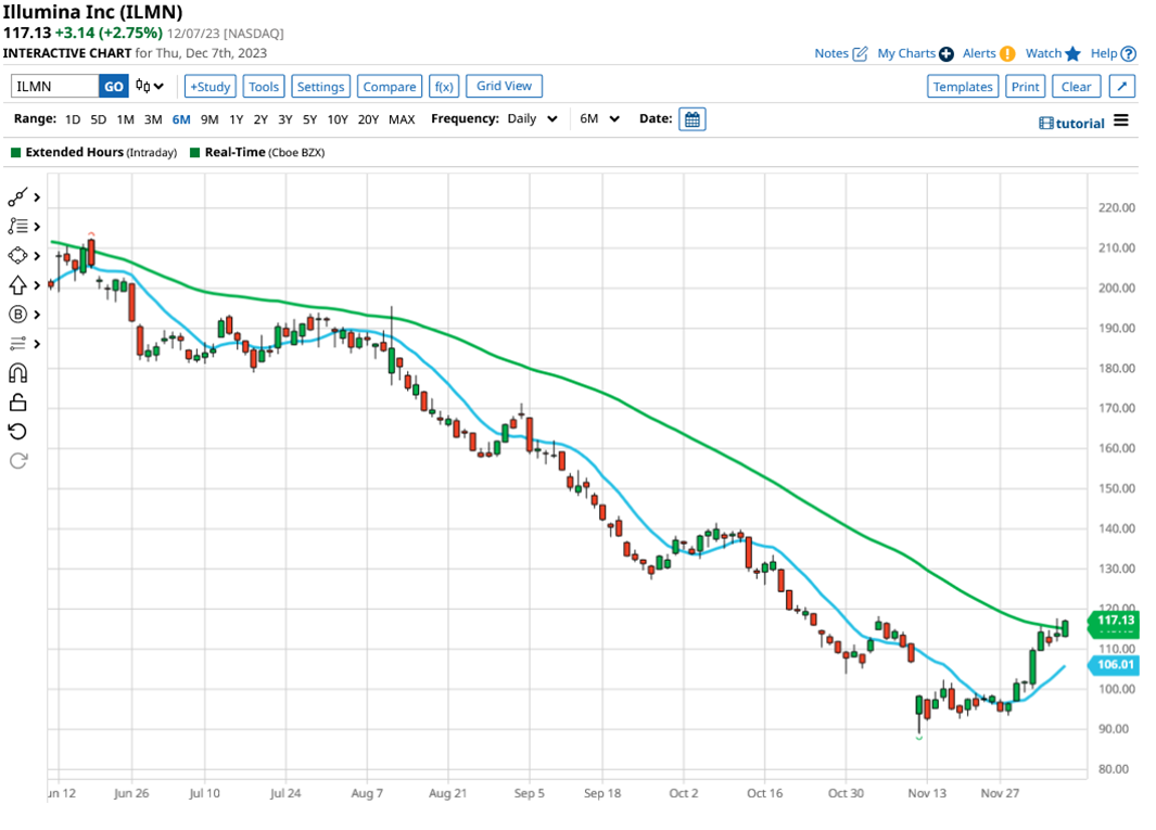
One stock that meets those criteria is Illumina, ticker ILMN the stock is up by +14.89% over the previous week the 10-day MA is at $106.01, and the 50 Day is up at $115.15.

There is no doubt that there has been upside momentum in this stock price. The question here is whether that momentum can continue.
As we can see in the chart above the Illumina stock price is sitting on the 50-day MA line, which itself is adjacent to a prior resistance level and failure point from early November.
Immediately then, we’ve found a stock that’s moving, that is interacting with a moving average, and which is close to testing at the prior high and failure point, which we can think of as resistance.
That's just the type of market intelligence that's traders love, because it gives them an axe to grind.
The information provided does not constitute investment research. The material has not been prepared in accordance with the legal requirements designed to promote the independence of investment research and as such is to be considered to be a marketing communication.
All information has been prepared by ActivTrades (“AT”). The information does not contain a record of AT’s prices, or an offer of or solicitation for a transaction in any financial instrument. No representation or warranty is given as to the accuracy or completeness of this information.
Any material provided does not have regard to the specific investment objective and financial situation of any person who may receive it. Past performance is not a reliable indicator of future performance. AT provides an execution-only service. Consequently, any person acting on the information provided does so at their own risk.