If trading the market was like taking a journey in your car then ..........
Not so long ago (November) we were driving down a flat three lane highway without a care in the world.
Somehow, we were suddenly diverted off, of that orderly well well-maintained road, and onto what feels like a rutted track, with potholes you could fall down, and obstacles that we have to weave around or otherwise negotiate.
How did we get here?
Quite simply, the market fell out of love with Donald Trump.
Or at least it came to realise that even if he did have all the answers (?) and the silver bullets to fix America's ills, there would be consequences in firing them.
Some of which wouldn't be very palatable as far as the markets were concerned.
Remember that markets try to avoid politics where possible, dislike uncertainty, and distrust brinkmanship.
Well, we have seen plenty of all three in recent weeks, including a stream of tariffs, and the dressing down of world leaders, beamed live around the globe, from the White House.
People forgot that Trump isn't a politician, nor are many of those around him, and diplomacy certainly is their watch word. Payback is.
The change in sentiment can be seen in the charts.
If we look at the S&P 500's performance since November 4th, we see a period of initial gains, then a sideways move, a last hurrah (new high), and then from Feb 19th, an ongoing trend reversal.
S&P 500 Index since the US election

Source:Barchart.com
The negative mood has spread across many of the 11 S&P 500 sectors, including the likes of Energy Financials and Information Technology. All of which have been part of the leadership of the market in the not too distant past.
S&P 500 Index and Sectors MA % Heatmap

Source:Barchart.com
A chart like this one below, captures the change in sentiment perfectly.
Showing as it does the rolling number of new 1-month highs, posted among stocks listed on the Nasdaq exchange, over the last 6-months; the pink line is there to illustrate the direction of travel, as much as anything else.

Source:Barchart.com
Mega-cap stocks have played their part in this demise - here are the Magnificent 7 ranked by 3-month percentage change, descending.
The Magnificent Seven stocks

Source:Barchart.com
Here is the information Technology sector index vs Nvidia, since the election to reinforce the point.

Source:Barchart.com
Creating a map of our own
When we find ourselves in unfamiliar territory, we need a map and if it's uncharted, then we need some pointers about exactly how the land around us lies.
However, we can get quickly acquainted with the new geography.
On this chart we capture the weekly percentage change in major equity markets, plotted against the year over year percentage change: There is clear divergence between the Dax or DE40 index and its US peers. Both annotated with red boxes.
The Dax is up on the both the week, and YoY. Whilst the US indices (Dow, S&P and Nasdaq) are down on weekly basis and are seeing their YoY gains bleed away as well.
Major equity indices percentage change weekly vs Year over Year

Source: Trading Economics
There may be more of this sort of thing to come as well because with President Trump having put the defence of Europe back in the European court, as it were.
The Germans and others have pledged hundreds of billions of Euros of additional spending on defence and infrastructure.
Much, if not all of which will be spent in the domestic/mainland European economy.
A multiplier effect
Let’s not forget that the €500.00 billion pledged by Germany won’t just get spent once, rather it will create a multiplier effect that ripples out through the economy. The resulting opportunity could be significant.
Consider this comment from US investment bank Jefferies on the relative valuation of large and mid-cap German equities:
“In recent years mid-cap companies have been punished for their higher domestic exposure and their predominantly European customer base. Since 2022 the German MDAX has underperformed the DAX by a staggering 61%. At the same time, the relative valuation of European Mid-Caps compared to Large-Cap names stands at a historical low”
And in a similar vein, here is a table that captures S&P 500 stocks which have become oversold on the RSI 14 indicator. All of which have a score below the oversold boundary of 30.0%.
The table is ranked by stock beta descending.
Beta is a measure of sensitivity in this case, how sensitive a stock is to a change in the underlying index, of which it’s a member (S&P 500).
So we have a list of technically oversold US stocks, ranked by their sensitivity to an improvement in the performance of the index.
Not a bad place to start creating a watchlist from, you might think..
There are two caveats which are:
Beta works in both directions, that’s up and down.
And just because something becomes oversold on RSI 14, that doesn't mean that the price, and the RSI 14 reading can’t go lower still.
However, we can use these types of tools, and information, to become familiar with our new surroundings and to prepare ourselves for what comes next.
S&P 500 stocks with an RSI 14 score of less than 30.0 ranked by their stock beta
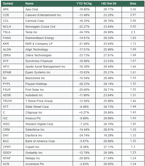
Source:Darren Sinden/Barchart.com
The information provided does not constitute investment research. The material has not been prepared in accordance with the legal requirements designed to promote the independence of investment research and as such is to be considered to be a marketing communication.
All information has been prepared by ActivTrades (“AT”). The information does not contain a record of AT’s prices, or an offer of or solicitation for a transaction in any financial instrument. No representation or warranty is given as to the accuracy or completeness of this information.
Any material provided does not have regard to the specific investment objective and financial situation of any person who may receive it. Past performance is not a reliable indicator of future performance. AT provides an execution-only service. Consequently, any person acting on the information provided does so at their own risk.