
We start with a table, that shows the performance of sectors within the S&P 500 index over the year to date.
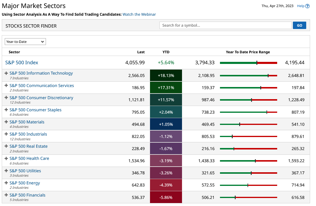
As we can see the performance among these individual groups of stocks has been very mixed one might say polarised, with financials and energy underperforming sharply and information technology and communications services, both strongly outperforming the wider index in the first four months of the year.
But what happens if we wind the clock back and look at the performance of the S&P sectors over 12 months instead?
Well, we get a very different-looking set of results or data.
One where Energy is the top-performing sector, having booked a 14% plus outperformance over the S&P 500. Information technology has also outperformed, in that time scale but to a far smaller degree.
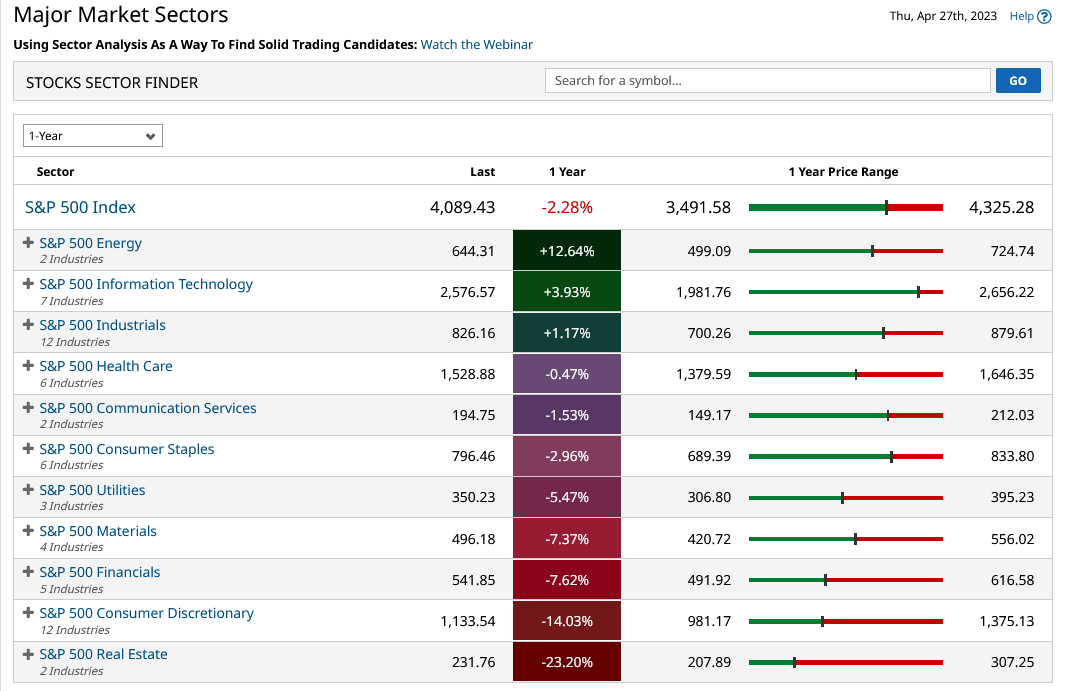
From the second table, we can perhaps get a sense that regime change was underway and when we look to the far right-hand side, at the sliders that indicate where a sector sits within its one-year price range. Then, energy was at best a little over halfway in that range, whilst information tech was much closer to its 12-month highs than any other sector.
And if we look at the number of new highs posted by the information technology sector during a variety of time frames, we can see the way momentum in the sector built over time.
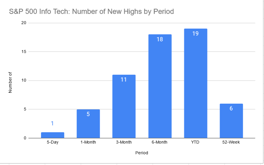
Remember that an uptrend is merely a progression of higher lows and higher lows and the histogram of period highs above is really just a visualisation of a medium-term move higher in the information technology sector.
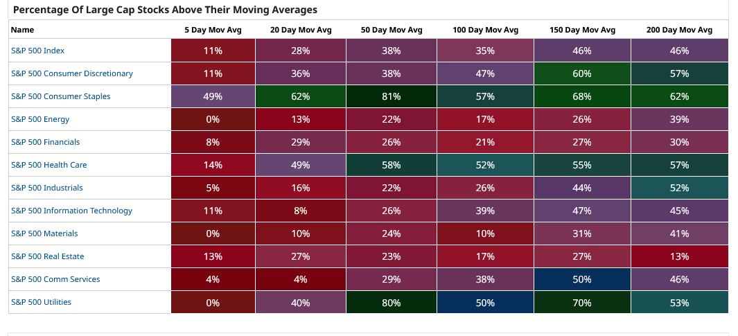
Now let's consider the table below which is a heat map that tracks the percentage of stocks within the S&P500, and its constituent sectors, that are trading above selected moving averages.
This matrix is essentially a map of momentum within a sector, over both the short and long term, ranging from 5 days, or a trading week, out to 200 days which is just under 80% of a trading year.
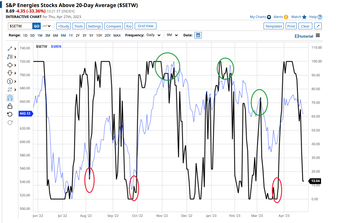
Let's dig a bit deeper here and take a look at the percentage of stocks within the energy sector, that are trading above their 20-day moving average and how that metric varies over time.
To do that I have drawn a 9-month chart of the moving average percentage- see below.
We can immediately see that the MA % moves between being oversold, or a reading of zero and overbought at 100 percent.
Thats tells us that the energy sector is prone to short-term price swings or volatility.
Which is often what traders are looking for in the market.
How can we exploit that information?
Well, one way is to chart the swings in the 20 D MA percentage against the underlying sector index. Which, in the chart below is signified by the blue line.
I have used green and red ellipses to highlight turning points in the MA percentage, which themselves lead turning points in the energy sector index.
The inference here is that when the MA percentage turns sharply, particularly at the overbought and or oversold boundaries, then a move in the sector index often follows.
So how could you turn this knowledge into trading opportunities and potential profits?
Well, one way would be to trade the S&P 500 energy sector ETF ticker XLE
Alternatively we could look at high beta stocks in the sector, beta is a measure of the sensitivity of stock price for a given move in its underlying index or sector. High beta stocks are more sensitives to those moves - or put another way their prices are more reactive.
Examples of high beta stocks in the S&P 500 energy sector include Apa Corp (APA), Baker Hughes(BKR) and ConocoPhillips (COP).
One of the things I try to do in my research and market commentary is to use tools that are available for free, all of the charts and tables in this article are drawn from Barchart.com which has free or subscription services.
Why do I use free tools where I can?
Because when you are starting out in trading you need to keep your costs low and profits high in order to grow your capital
The information provided does not constitute investment research. The material has not been prepared in accordance with the legal requirements designed to promote the independence of investment research and as such is to be considered to be a marketing communication.
All information has been prepared by ActivTrades (“AT”). The information does not contain a record of AT’s prices, or an offer of or solicitation for a transaction in any financial instrument. No representation or warranty is given as to the accuracy or completeness of this information.
Any material provided does not have regard to the specific investment objective and financial situation of any person who may receive it. Past performance is not a reliable indicator of future performance. AT provides an execution-only service. Consequently, any person acting on the information provided does so at their own risk.